CCCU Email Design System
Writing, design, data and governance — built around the idea that email is a digital product worth taking seriously.
Why it matters
A template review uncovered a much bigger problem: CCCU had no shared system for creating, writing or managing email.
What I did
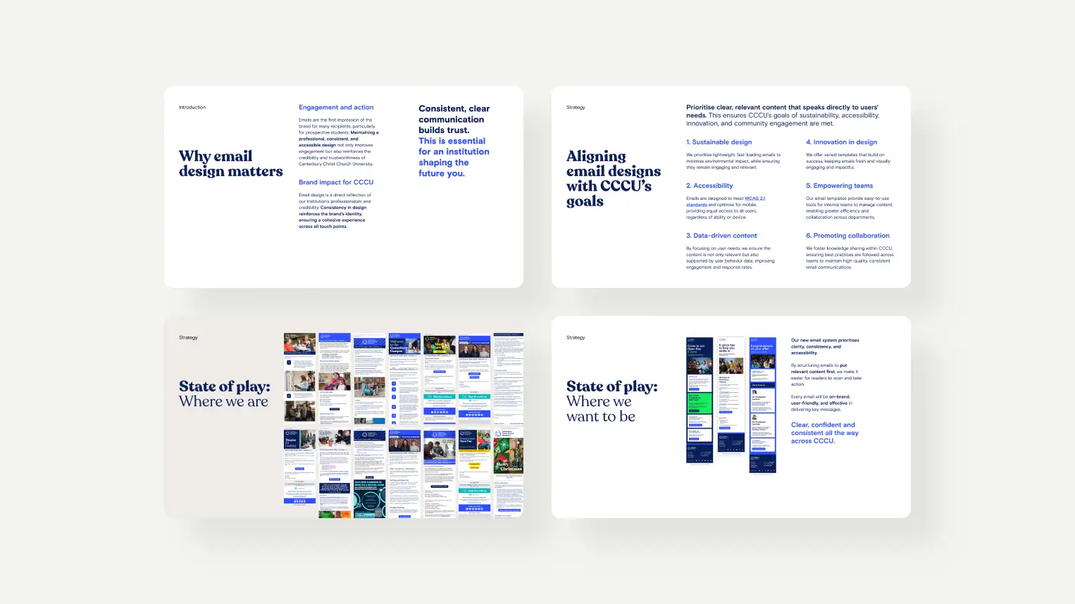
Turned the brief into a content-first email design system, covering templates, writing, accessibility, governance, data and implementation.
A template review uncovered a much bigger problem: CCCU had no shared system for creating, writing or managing email.
What I did
Turned the brief into a content-first email design system, covering templates, writing, accessibility, governance, data and implementation.
What it shows
I work at the level of the problem, not the brief. Strategy, process, governance and design. Connected to business goals from the start.
The result
One shared approach adopted across 13 teams, supporting 1.6M+ emails and giving CCCU a foundation for data led continuous improvement.
I work at the level of the problem, not the brief. Strategy, process, governance and design. Connected to business goals from the start.
The result
One shared approach adopted across 13 teams, supporting 1.6M+ emails and giving CCCU a foundation for data led continuous improvement.
01
The Problem
Nobody asked for a design system. I was asked to take a look at a template
I started with structured discovery. Interviews with 23 people across 13 teams revealed something more consequential than inconsistent design.
Every team had developed its own approach in isolation. Nobody had much visibility of what other teams were sending, how often, or to whom. There was no shared language, no governance structure and no single source of truth.
Thousands of emails were going out to students at every stage of their relationship with the university, from every corner of the institution, with no common understanding of what good looked like or why it mattered.
The absence of a system was the problem.
That discovery shaped everything that followed: the scope of the work, the principles behind it and the way it needed to be introduced to the people who would use it.
Every team had developed its own approach in isolation. Nobody had much visibility of what other teams were sending, how often, or to whom. There was no shared language, no governance structure and no single source of truth.
Thousands of emails were going out to students at every stage of their relationship with the university, from every corner of the institution, with no common understanding of what good looked like or why it mattered.
The absence of a system was the problem.
That discovery shaped everything that followed: the scope of the work, the principles behind it and the way it needed to be introduced to the people who would use it.
Transforming from varied to one voice: confident, clear and effective
What the work actually was
Email is easy to underestimate as a medium. At CCCU, it is one of the primary touchpoints between the university and its students, from the first contact with a prospective applicant through to life after graduation.
Treated properly, it is a digital product. It has users with specific needs at specific moments. It has measurable outcomes. It needs to be designed, written, tested and improved.
The fact that it arrives in an inbox rather than a browser does not change that.
The scope of the work grew to cover:
Guidelines and governance
A shared framework for how email should be planned, written, designed and reviewed.
Accessible, responsive templates
A small set of robust templates that worked across devices and email clients.
Content strategy
A writing framework built from scratch for CCCU's audiences and communication goals.
Data literacy
Helping teams understand what their email data could tell them and how to use it.
Platform implementation
A system that could work across Salesforce Marketing Cloud and TargetX, including the migration between them.
Adoption and support.
A structured rollout, team by team, with ongoing guidance built in from the start.
Treated properly, it is a digital product. It has users with specific needs at specific moments. It has measurable outcomes. It needs to be designed, written, tested and improved.
The fact that it arrives in an inbox rather than a browser does not change that.
The scope of the work grew to cover:
Guidelines and governance
A shared framework for how email should be planned, written, designed and reviewed.
Accessible, responsive templates
A small set of robust templates that worked across devices and email clients.
Content strategy
A writing framework built from scratch for CCCU's audiences and communication goals.
Data literacy
Helping teams understand what their email data could tell them and how to use it.
Platform implementation
A system that could work across Salesforce Marketing Cloud and TargetX, including the migration between them.
Adoption and support.
A structured rollout, team by team, with ongoing guidance built in from the start.
Ask the right questions early enough, and the brief changes
02
THE SYSTEM
Sustainability
CCCU sends hundreds of thousands of emails. At that scale, file weight becomes a design consideration.
The system uses lightweight templates, a maximum of two images per email and files kept under 100KB wherever possible. Gmail can clip messages above 102KB, but the more important reason is simpler: oversized emails create unnecessary data transfer.
Designing responsibly means accounting for that.
CCCU sends hundreds of thousands of emails. At that scale, file weight becomes a design consideration.
The system uses lightweight templates, a maximum of two images per email and files kept under 100KB wherever possible. Gmail can clip messages above 102KB, but the more important reason is simpler: oversized emails create unnecessary data transfer.
Designing responsibly means accounting for that.
Accessibility
The standard was not simply WCAG 2.1 compliance. The aim was to make a CCCU email work for everyone, regardless of device, connection quality or ability.
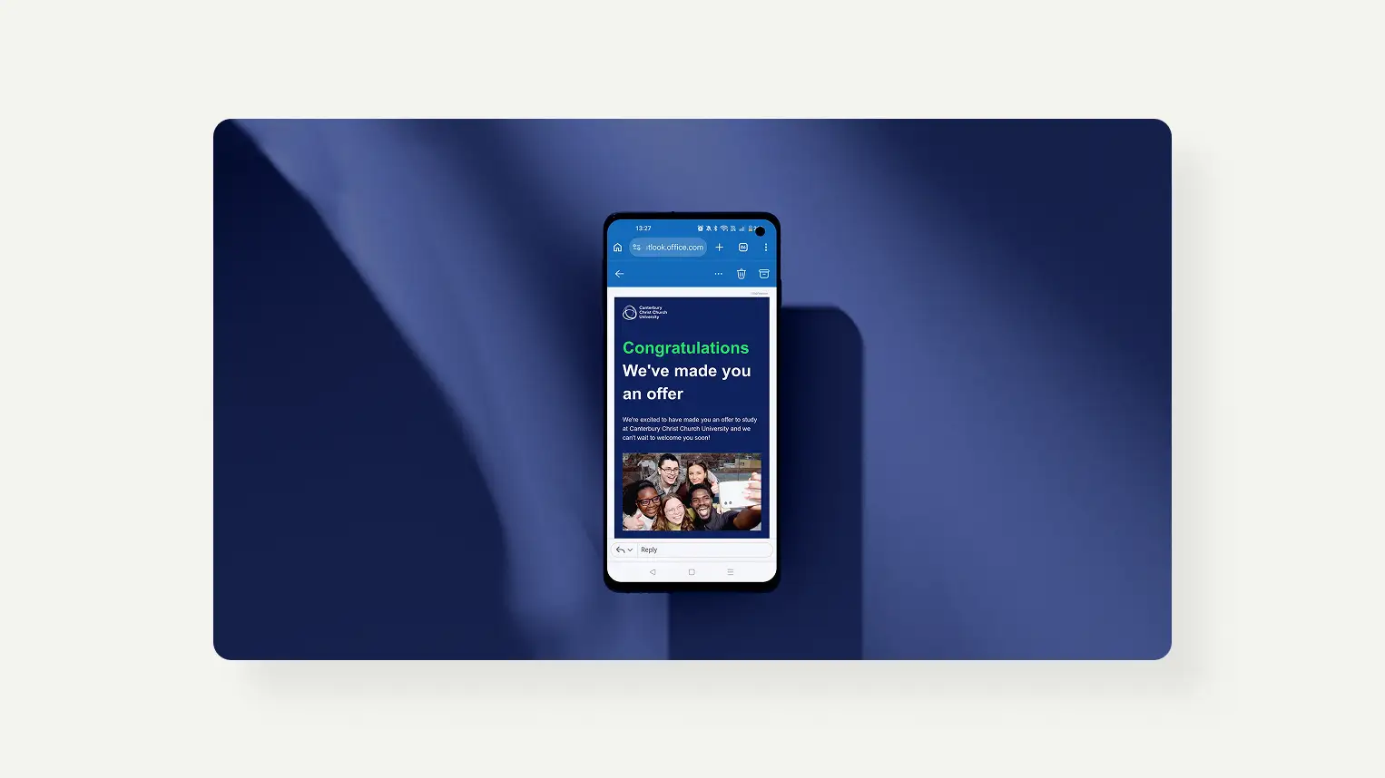
No text in images. Meaningful alt text. Sufficient contrast and font size. Layouts that still make sense when images do not load.
These are not concessions to edge cases. They are the conditions under which real students receive their email.
The standard was not simply WCAG 2.1 compliance. The aim was to make a CCCU email work for everyone, regardless of device, connection quality or ability.
No text in images. Meaningful alt text. Sufficient contrast and font size. Layouts that still make sense when images do not load.
These are not concessions to edge cases. They are the conditions under which real students receive their email.
Continuous improvement
The system was not designed to be finished.It was designed to make improvement possible. Simple enough for teams with limited time and basic knowledge to use well. Structured enough that using it well would improve their understanding over time.
The goal was capability, not compliance.
The system was not designed to be finished.It was designed to make improvement possible. Simple enough for teams with limited time and basic knowledge to use well. Structured enough that using it well would improve their understanding over time.
The goal was capability, not compliance.
Principles before pixels
Every decision in the system was made against three principles.
A system people can improve within is worth more than a perfect system nobody quite understands

Make the right thing the obvious thing
If the system demanded significant effort or expertise to use correctly, it would not be used correctly. Not because the teams were unwilling, but because email is rarely anyone's primary responsibility.
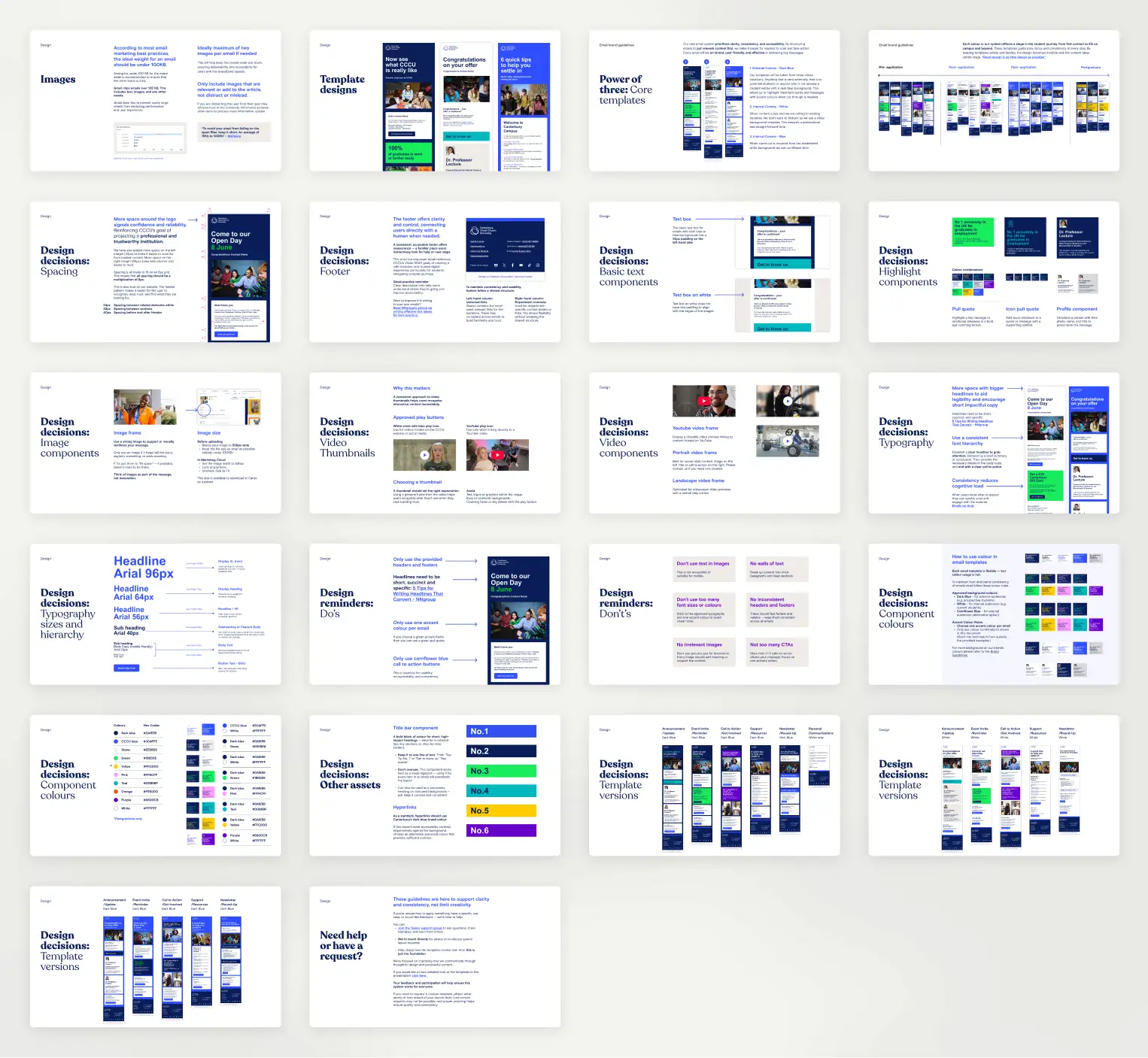
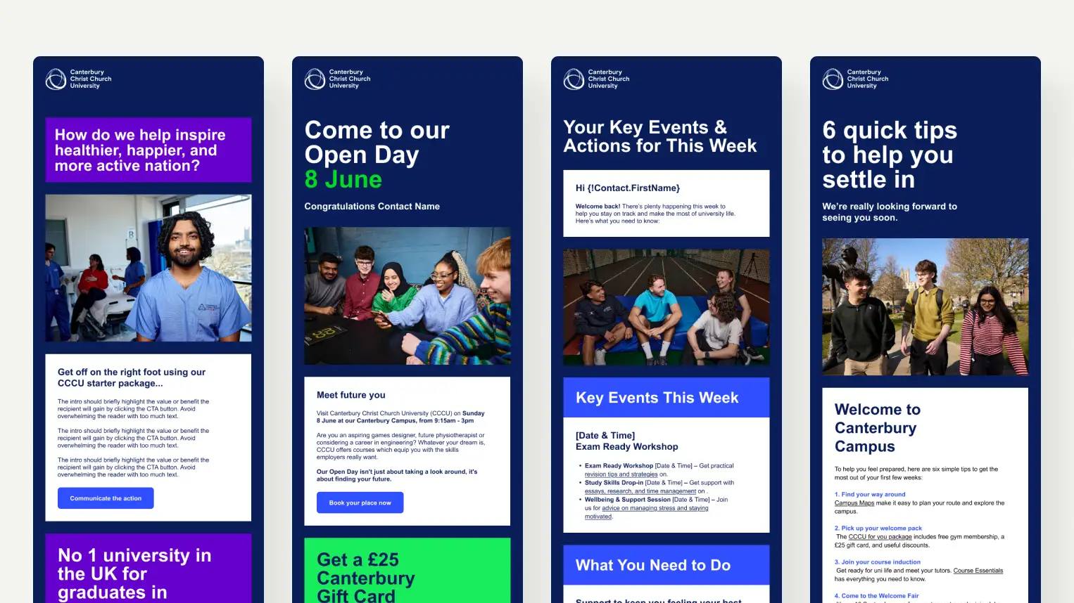
Three core templates were mapped to different audience relationships and communication purposes.
A component library was built around how people actually read email: scanning first, then deciding whether something deserves their attention.
NN/g research into how people scan digital content reinforced the need for clear hierarchy, short sections and prominent actions. That thinking informed everything from headline placement to the position of the primary call to action.
Colour became a system signal rather than an aesthetic choice. Each colour maps to a stage in the student journey and carries a consistent visual weight that builds recognition over time.
Typography and spacing follow an 8px grid, consistent with the CCCU website. The result is a quiet familiarity that builds trust.
The system also had to be honest about its technical constraints.
Outlook remains a particularly restrictive environment for email design. Many of the techniques a designer would normally reach for simply do not behave reliably. Rather than fighting those limitations, the system uses simplicity and consistency as features.
The result is robust enough to hold together across clients, devices and different levels of digital confidence, while still giving teams genuine creative room within the brand.
Three core templates were mapped to different audience relationships and communication purposes.
A component library was built around how people actually read email: scanning first, then deciding whether something deserves their attention.
NN/g research into how people scan digital content reinforced the need for clear hierarchy, short sections and prominent actions. That thinking informed everything from headline placement to the position of the primary call to action.
Colour became a system signal rather than an aesthetic choice. Each colour maps to a stage in the student journey and carries a consistent visual weight that builds recognition over time.
Typography and spacing follow an 8px grid, consistent with the CCCU website. The result is a quiet familiarity that builds trust.
The system also had to be honest about its technical constraints.
Outlook remains a particularly restrictive environment for email design. Many of the techniques a designer would normally reach for simply do not behave reliably. Rather than fighting those limitations, the system uses simplicity and consistency as features.
The result is robust enough to hold together across clients, devices and different levels of digital confidence, while still giving teams genuine creative room within the brand.
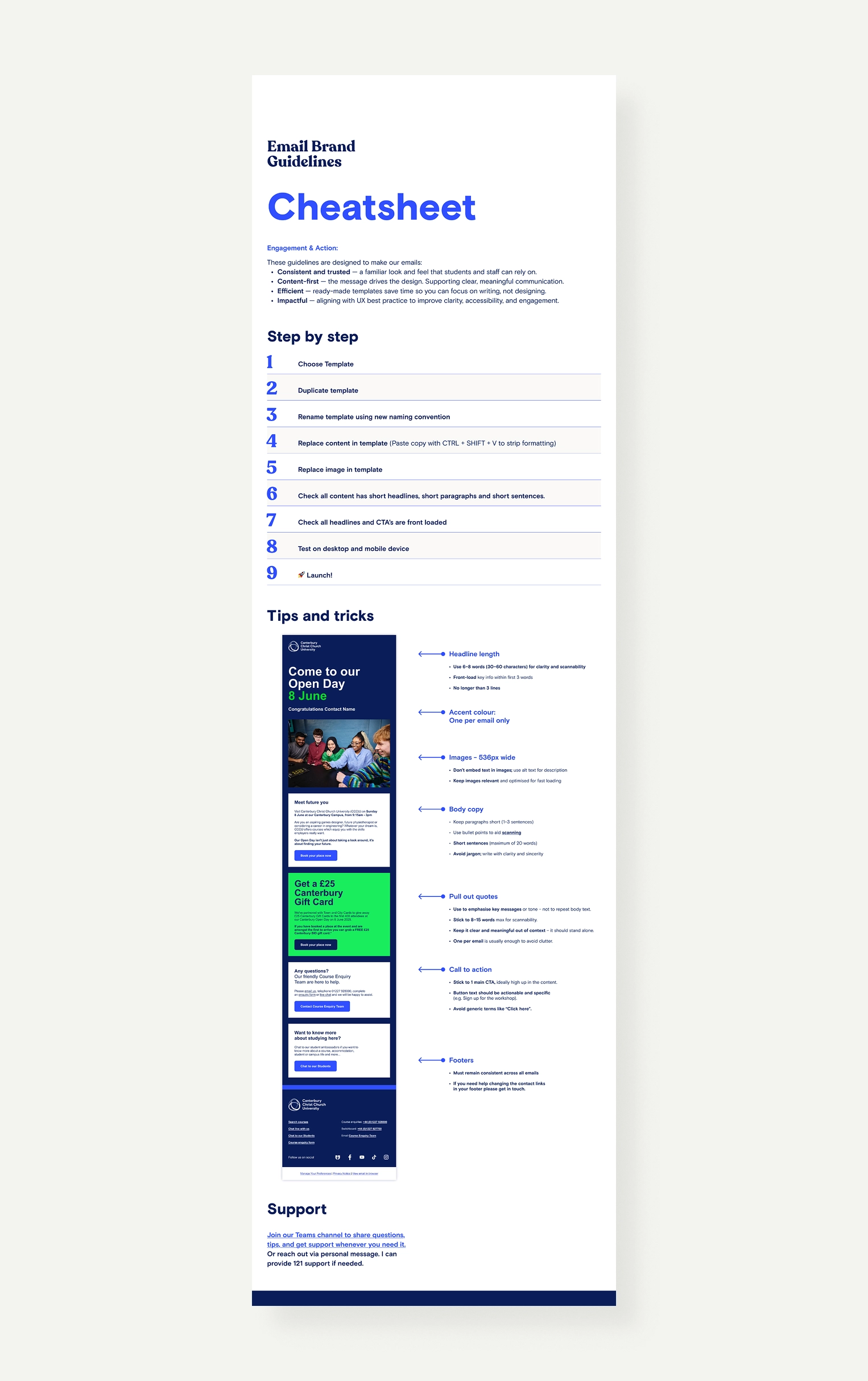
This is guidance, not a rulebook. Test, adapt, and evolve your approach. The best email strategy is the one your readers actually engage with.

03
More than design
Design supports,
never distracts
The content strategy embedded in the guidelines is not supplementary to the design work. It is the same problem approached from a different direction.
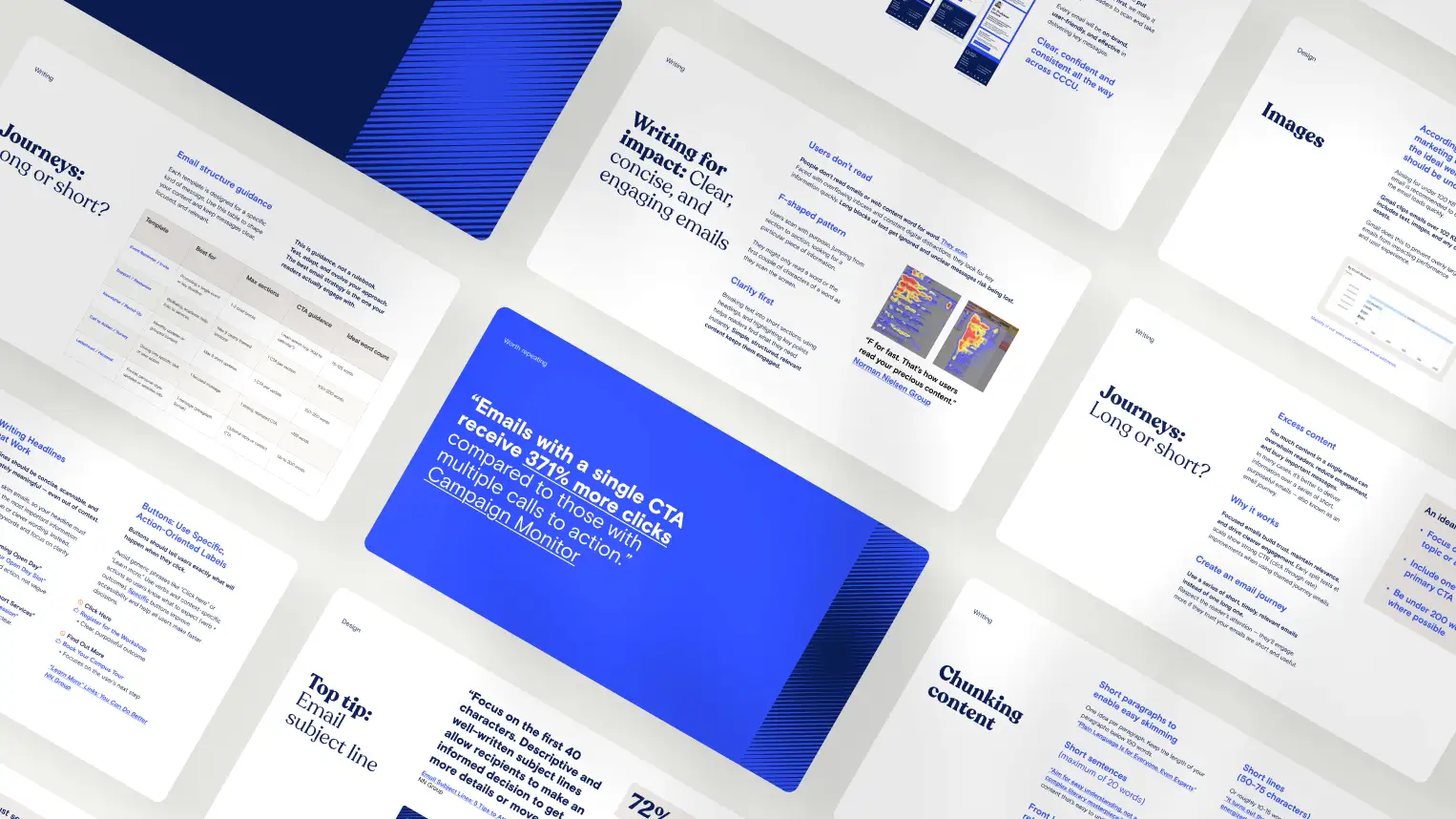
The writing framework was built from scratch, drawing on NN/g research and adapted specifically for CCCU's audiences, platforms and communication goals.
It is grounded in how people read digital content: scanning before reading, making decisions quickly and forming impressions of the sender that persist long after the email is closed.
The framework covers the mechanics of good email writing.• Front-loaded subject lines
• One primary purpose per send
• Calls to action that describe an outcome
• Headlines that communicate immediately and work out of context
• Short, purposeful email journeys rather than overloaded individual sends
• Plain language and descriptive links that improve accessibilityThe aim was not to prescribe what to write.
It was to build a shared understanding of writing as a design decision. One that shapes how information lands, how actions are taken and how the institution is perceived.
The writing framework was built from scratch, drawing on NN/g research and adapted specifically for CCCU's audiences, platforms and communication goals.
It is grounded in how people read digital content: scanning before reading, making decisions quickly and forming impressions of the sender that persist long after the email is closed.
The framework covers the mechanics of good email writing.• Front-loaded subject lines
• One primary purpose per send
• Calls to action that describe an outcome
• Headlines that communicate immediately and work out of context
• Short, purposeful email journeys rather than overloaded individual sends
• Plain language and descriptive links that improve accessibilityThe aim was not to prescribe what to write.
It was to build a shared understanding of writing as a design decision. One that shapes how information lands, how actions are taken and how the institution is perceived.

04
THE TOOLs
A system built for everyday use
Every component, every guideline, every piece of content strategy was tested against how teams would actually use it: inside Salesforce Marketing Cloud, under real sending conditions, with real content, produced by people for whom email is one task among many rather than a primary specialism.
The system was also built to survive a platform migration. CCCU moved from TargetX to Marketing Cloud during the course of this work.
Building something portable, that could function across both platforms and transfer cleanly as teams made the switch, shaped every structural decision from the beginning.
A system that only works in ideal conditions is not a system. It is a prototype.
The system was also built to survive a platform migration. CCCU moved from TargetX to Marketing Cloud during the course of this work.
Building something portable, that could function across both platforms and transfer cleanly as teams made the switch, shaped every structural decision from the beginning.
A system that only works in ideal conditions is not a system. It is a prototype.

05
ADOPTION
The hardest part had nothing to do with design
Getting 13 teams to change how they work, when they have no spare time, no formal obligation, and no particular reason to trust something new, requires a different kind of thinking to designing a system in the first place.
The approach was deliberately not uniform. Some teams were motivated by quality and wanted to improve. Some needed data to justify the time investment. Some needed the workflow to be demonstrably simpler before they would engage with anything else.
Some were carrying habits and workarounds that had never been questioned, and needed to be shown, patiently and through examples from their own context, that another way was available. Each conversation was different. Each presentation was tailored. The selling, in the honest sense of that word, has not stopped and probably will not.
What made it possible was grounding every conversation in goals the team already cared about. Not "this is the right way to do email" but "here is how this makes your communications more effective, more accessible, and less work to produce." The system had to earn its place in people's workflows. That work is still ongoing.
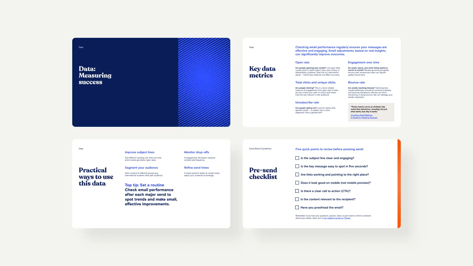
The Teams support hub, weekly guidance, tutorial recordings and real-time Q&A were not afterthoughts bolted on after launch. They were a core part of the design: the infrastructure that makes the rest of it sustainable.
The approach was deliberately not uniform. Some teams were motivated by quality and wanted to improve. Some needed data to justify the time investment. Some needed the workflow to be demonstrably simpler before they would engage with anything else.
Some were carrying habits and workarounds that had never been questioned, and needed to be shown, patiently and through examples from their own context, that another way was available. Each conversation was different. Each presentation was tailored. The selling, in the honest sense of that word, has not stopped and probably will not.
What made it possible was grounding every conversation in goals the team already cared about. Not "this is the right way to do email" but "here is how this makes your communications more effective, more accessible, and less work to produce." The system had to earn its place in people's workflows. That work is still ongoing.
The Teams support hub, weekly guidance, tutorial recordings and real-time Q&A were not afterthoughts bolted on after launch. They were a core part of the design: the infrastructure that makes the rest of it sustainable.
06
OUTCOME
The system is in use.
The work is not finished
Greater consistency across teams. Communications that feel like they come from the same institution, with the same values and the same level of care. A shared language for talking about content, design and audience that did not exist before.
An approach to digital communication that is beginning to influence how CCCU thinks about brand consistency more broadly, because trust is built through every interaction, and every digital interaction is a design decision whether it is treated as one or not.
Part of the ongoing work is building the data practice that allows teams to improve independently over time: reading their own performance, adjusting their approach, and understanding that the emails they send do not exist in isolation. Frequency, volume and relevance are institutional concerns, not just individual ones.
The next stage is elevating that awareness across the business, helping people understand the cumulative effect of their sending behaviour on the institution's relationship with its students, and giving them both the knowledge and the motivation to make better decisions.
Designing the templates was the easy part.
An approach to digital communication that is beginning to influence how CCCU thinks about brand consistency more broadly, because trust is built through every interaction, and every digital interaction is a design decision whether it is treated as one or not.
Part of the ongoing work is building the data practice that allows teams to improve independently over time: reading their own performance, adjusting their approach, and understanding that the emails they send do not exist in isolation. Frequency, volume and relevance are institutional concerns, not just individual ones.
The next stage is elevating that awareness across the business, helping people understand the cumulative effect of their sending behaviour on the institution's relationship with its students, and giving them both the knowledge and the motivation to make better decisions.
Designing the templates was the easy part.

+34%
Click Rate
−52%
unsubscribe rate
1.6M+
Emails
44–47%
opens from targeted variants vs 32–35% mass sends
What happens next
The early results are encouraging, but this is only a snapshot of the Clearing season so far. More importantly, it gives us a baseline for continuing to test, learn and improve.
The launch was never intended to be the end of the project. The challenge is not to turn everyone into an email specialist. It is to give people the knowledge, tools and confidence to make better digital decisions when communication becomes part of their job.
And this shouldn't stop at email.
The same principles apply to website content, digital services and every other touchpoint where people experience CCCU. Over time, I want to extend this thinking into how the brand is represented internally too: helping employees understand how their everyday communications contribute to a consistent, accessible and recognisable experience.
This is the beginning of a much broader piece of work around digital continuity, brand stewardship and shared responsibility.
The data gives us evidence. The system gives us a foundation. The next challenge is turning both into everyday practice.
The launch was never intended to be the end of the project. The challenge is not to turn everyone into an email specialist. It is to give people the knowledge, tools and confidence to make better digital decisions when communication becomes part of their job.
And this shouldn't stop at email.
The same principles apply to website content, digital services and every other touchpoint where people experience CCCU. Over time, I want to extend this thinking into how the brand is represented internally too: helping employees understand how their everyday communications contribute to a consistent, accessible and recognisable experience.
This is the beginning of a much broader piece of work around digital continuity, brand stewardship and shared responsibility.
The data gives us evidence. The system gives us a foundation. The next challenge is turning both into everyday practice.


